
Start with the clothes you actually wear
Look at the outfits you reach for during an ordinary week and note the main colours and textures. A fine French tip or a sheer pink can sit naturally beside cream, grey and pale blue. Cherry red can give a dark or monochrome wardrobe a clear focal point. There is no universal rule that matters more than enjoying the result yourself.
Give one detail the leading role
Magnetic shimmer, pearl embellishments, glossy colour and bold jewellery can compete for attention when used together. Choose the detail you like most, then let simpler rings, bracelets or fabric textures support it. For a celebration, consider the dress, flowers and accessories together instead of selecting a nail photograph in isolation.
Check the effect in more than one light
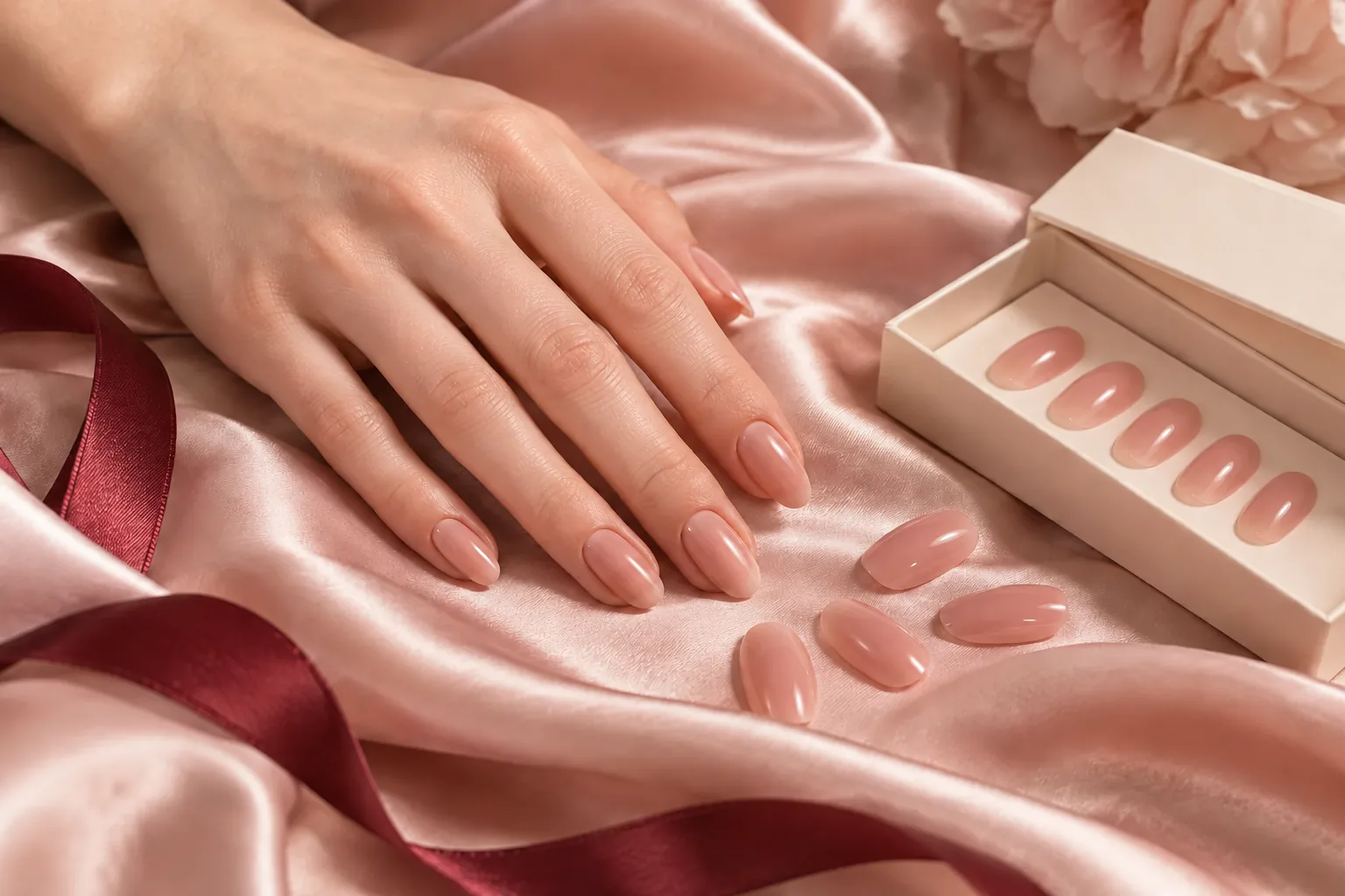
Translucent, pearlescent and magnetic finishes change with the light. View a sample in daylight and in the indoor lighting you normally use, and see whether the colour still feels right. A screen is useful for choosing a direction, but a physical sample is more informative when an outfit needs a precise match or the occasion is especially important.
Leave room for your routine
Consider the way you use your hands as well as the appearance of the design. A familiar length and restrained decoration may be a useful starting point when typing or handling small objects is part of your day. Once you know the shape that works for you, exploring several colour stories within that silhouette can make your personal collection feel more consistent.